How do I do my own book design?
So you’re self-publishing and you want to design your book...Book design is hard—one of the hardest forms of design there is. Books look easy. They’re not. I’ve done book design, and I’ve had books professionally published designed by professional designers, and there’s a lot of “there” there, far more than can be covered in one web page, but I will try to cover the basics here. This should give you a sense of how deep the rabbit hole goes, if nothing else...
So let’s start with fonts. If you’re familiar with any sort of writing at all, you know there are different fonts, and you know they look different, but how do you choose a font for book design?
I’ll begin by putting this out there: Arial, Helvetica, and Verdana are absolutely positively not suitable for book design. Using one of these typefaces as your body type instantly marks you as an amateur. Even readers who don’t know book design will think the book looks amateurish, though they won’t necessarily be able to explain why.
All these typefaces are sans serif. Generally speaking, sans serif typefaces are not suitable for long stretches of text. They’re suitable for headlines and display type; you can use them for chapter headers, but never for body type.
Fonts with serifs are easier to read in long stretches, because the serifs guide your eye from letter to letter.

Sans-serif font (Verdana). The ends of the strokes are simply cut off.

Serif font (Freight Text). The serifs are the ornaments on the end of each stroke.
The size of type you use will vary, depending on the size of the book, the margins, and other factors, like the genre and whether you’re trying to publish a trade paperback (generally higher quality with a more expensive, upscale feel) or a mass market paperback (generally cheaply printed, like the books you get in airport bookstores or Walmart).
The typeface will influence this, because different typefaces look different at the same size, so let’s talk typeface first.
For setting body type, you’ll want a typeface that matches the mood of the book. Different faces have different feels. A historical fiction novel? Choose a classic typeface like one of the Garamonds, or Caslon. A science fiction novel? Choose a modern body face like Freight Text or Jenson. A mystery? You can’t go wrong with Baskerville. A very long nonfiction book? I really like Stone Print, though it’s quite pricey.
For example, the far-future, post-scarcity erotica Eunice and I write is set in Adobe Garamond. The chapters don’t have titles, only numbers, which are set in a sans-serif face called Syncopate.

On the other hand, our post-cyberpunk novel is set in Freight Text, a much more modern serif body font, with the chapter numbers set in a glitch face called Cymptums, and chapter title, drop cap, and page number set in a sans-serif face called Simplifica.

Both these pages are set at the same size, 11 point type with 13.5 point leading. You can see that they don’t look the same. Garamond is wider, with lowercase letters that aren’t quite as tall (look at the capital Ws and the lowercase os and you can really see the difference).
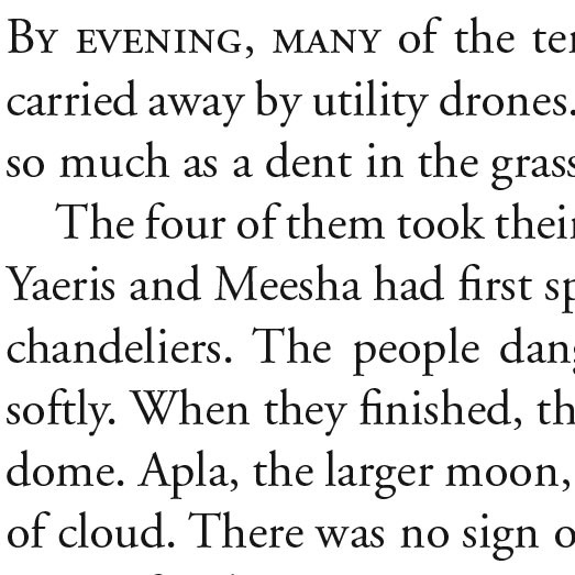
Adobe Garamond

Freight Text
oth these books are also the same size—6x9 trade paperbacks, which makes them a bit larger than most mass-market paperbacks—so there’s plenty of room for those nice, luxurious wide margins.
Note that the margin for the gutter—the part of the page that’s bound—is slightly wider than the margin for the outside edge. The text isn’t centered on the page, because the binding that holds the book together makes it harder to read text on that edge than text on the outer edge.
You can see this a bit better on a full page of text:
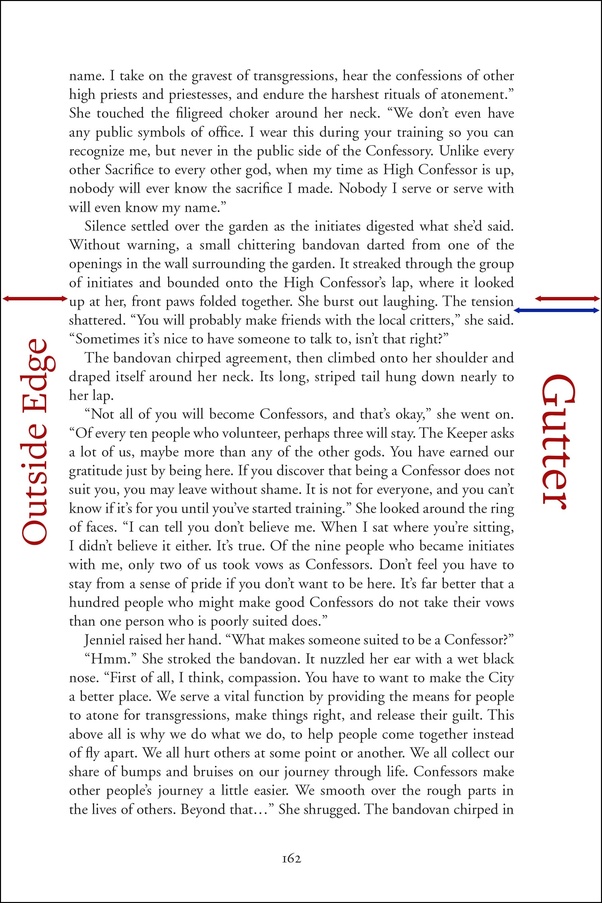
The red arrow shows how large the margin is on the outside edge of the page; the blue arrow shows how much larger it is on the gutter. (Both red arrows are the same length in this image.)
Page numbers are usually either centered or on the outside edge in the bottom margin, or in the outside edge in the top margin. The trend these days is for page numbers generally to go on the bottom, though nonfiction still frequently puts them at the top.
One tricky, fiddly point: widows and orphans. You do not want a single line of text hanging on the bottom or top of the page (unless it’s a single-line paragraph, such as in dialogue); it looks awkward. You also don’t want to change the spacing between lines on different pages; instead, you can increase or decrease the bottom margin to wrap a line of text up or down.

The red circles show a widow (top) and an orphan (bottom), a single line of text that begins or ends a paragraph left hanging.
By wrapping the preceding page down one line, you can fix the problem:

A formatting note: You’ll notice that paragraphs are indented, unless they’re the start of a chapter (or subsection). You don’t indent the first line at the start of a heading or subheading, though it’s common to ornament them in other ways, such as by setting the first three words in smallcaps, using a drop cap, or both.
If you’re self-publishing, it night be worthwhile to pay someone experienced in book design to do all this. For one thing, you probably don’t have the right tools; this is not something you do in Microsoft Word, it’s something you do in a page layout program like InDesign.
There are other niceties you’ll need to know as well. For example, a book starts with a half-title, a title page, and a copyright page, all of which are laid out in a very precise way:
Half-Title Page

Title Page
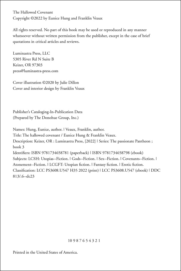
Copyright Page
The format of the copyright page is particularly important. Each line means something. The big block of letters and numbers in the middle is the cataloguing-in-publication block, which is used to categorize this book so that people know how to shelve it in libraries and bookstores. The line of numbers across the bottom, 10 9 8 7 6 5 4 3 2 1, tells you the printing. On a second printing, you remove the 1, on a third printing your remove the 1 and 2, and so on. So if you see a title page with 10 9 8 7 6, that tells you the copy you’re holding is the sixth printing. (This line does not appear in an eBook, only a print book.)
If you find a traditional publisher, the publisher will decide all this. In fact, the publisher will probably not give you a say. This is what they do, after all, and they’re experts at it.
How do you choose a font size?
This will, of course, vary depending on whether you’re writing a manuscript, submitting to a publisher, or designing a book yourself.
When you’re writing a manuscript, the answer is “whatever you want.” It makes absolutely no difference. A manuscript can be written in crayon. It doesn’t matter.
When you’re submitting your novel to a publisher for consideration, the answer is “whatever the publisher says.”
Every publisher has, somewhere on their website, their querying guidelines. The querying guidelines will tell you how the publisher wants your submission to be formatted. Some publishers might say 12-point Times Roman double-spaced with 1/2″ margins. Some might say 10-point Times Roman with 1″ margins.
Whatever they say, when you send your novel to that publisher, you must follow the guidelines to the letter. It will be different for every publisher and yes, that means you need to reformat it for each publisher you query.
This is a test. If you make the smallest error formatting your novel, the publisher will drop it in the trash unread and will not talk to you to tell you that’s what they’ve done. They say Times Roman and you format it with Helvetica? In the trash. They say 1/2″ margins and you use 3/4″ margins? They say single spaced and you double space it? In the trash, unread.
They do this because an author who cannot read, comprehend, and follow instructions is a nightmare to work with, and they don’t want you. “But my novel is so wonderful!” Doesn’t matter. You’re a nightmare to work with and they don’t want you.
For a book you’re designing for self-publishing, 10-12 points is a fairly typical body text size. The examples above are 11-point Adobe Garamond and Freight Text, though for smaller books than 6x9, 10-point text is not uncommon. Definitely avoid going below 10 points, though.